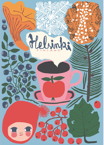
Finnish Travel Poster of the year 2020, 5th place!
The artist presents her artwork:
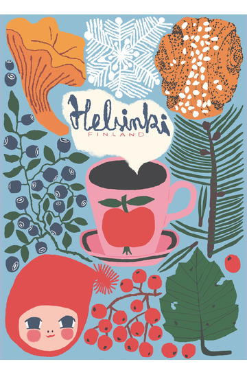
The poster is drawn digitally in Photoshop. I used the colors of Helsinki’s coat of arms; blue, yellow (gold), white (silver) and ruby red. Blue + yellow was used to color the birch leaf, red + yellow was used for the chanterelle and blue + red for the blueberries.
In Helsinki, the forest is always close by. Uutela, Viikki and the Central Park (Keskuspuisto) are easily reached in less than an hour. In the summer you can go for a swim and in the autumn you can pick mushrooms and bilberries (European blueberries).
I wanted the coffee to be really black, and that is why I used all colors. Helsinki has a number of quality coffee roasters and lots of wonderfully nice cafes and good coffee. All cafes usually provide delicious cinnamon buns and in the early part of the year also shrove buns.
Surely travel posters can’t simply remain a cry from the past?
Absolutely not. We live in a completely visual world where the picture is stronger than ever. That’s why the following question hit us: How would contemporary artists depict Finland of today?
We could not let that thought go, so since 2016 we annually arrange an international travel poster contest for different regions in Finland, and we’ve also asked specific graphic designers and artists to create new Finnish travel posters for us.
So now Finland once again attracts travellers with glamour and cries of joy from paradise. With the help of the travel poster!


